Monday, December 15, 2014

Award Commission

I was very excited when Melia, the key organizer of the Utah Winter Faire, contacted me to create award artwork for two sword fighting competitions to be held at the Winter Faire this year.

These are based on the Stefan Lochner Gebetbuch (aka Prayer Book) c. 1451. Despite the huge lead time I was provided, I was unable to start on these immediately due to personal reasons, and ended up finishing the second piece the night before the Faire, largely because I greatly underestimated how long it would take to paint the tiny gold details on all the orbs.

Due to this timing, I varied from period practice on the versals, but feel that they fit the feel of the overall pieces despite this. Normally the versals would be grounded on detailed diapering (tiny repetitive patterns), and the letters would be decorated with whitework. This modelbook also sports quite a bit of miniature work with the versals - a beautiful decorative feature that I simply didn't have the time to do.

Obviously, I used the same design for both pieces, but changed the color schemes, including the gold. While I feel that the second piece is very elegant on its own, the gold I chose was much cooler in tone and didn't have the same "zing" that the warm gold has, when compared side by side.  I'd love to hear your opinions/thoughts.

Pictures taken at strange angles to give you an idea of the light reflections on these extremely sparkly pieces. Click on the images to see up close.


The gold used is Finetec Artist Color Gold set, which are pan gouach paints made of mica. The shade above on the first is called Inca Gold, and below I used Moon Gold.


Tuesday, October 28, 2014

Scroll Case

Oh, this poor neglected blog... 

So I haven't been creating too much lately, or at least not that which I can share at this point, so here's a little something I made to help safely transport the Archery Champion scroll to its destination. My aim was that it's merely for transportation, and that the recipient return the case to their local group or Kingdom for re-use once they have their scroll safely at home.

I cannot make any claims as to the color-safety of keeping a piece of art in a fabric covered case for a significant amount of time, which is why it's important to pass the case on as quickly as possible. It's also important to note that because it's made of plain cardboard and fabric, it is not water-safe. At least, not for more than a drop or two.


This case is made with two custom-cut pieces of cardboard, which I cut specifically to be a good size for this scroll. Since this is a standard size paper, it will be good for many pieces in the future. The cardboard is about one inch larger than the paper on all four sides. 


I then sewed a cover for the cardboard using some remnant fabric in my stash. When sewn, I slid the cardboard leaves into the pockets and voila!


I chose to adhere the scroll to the case with a small piece of drafting tape (a very lightly-adhesive tape that will not damage the paper, made specifically for art projects - do not use masking tape!). Some people make similar cases with elastic bindings to help keep the scroll in the case, but I didn't want anything rubbing tightly against the artwork save the soft fabric itself. When the case is closed, there was little risk of it slipping out anyway, especially when treated with the care a piece of art deserves.

If there is interest, I'll make a step by step tutorial.

Monday, July 28, 2014

Archery Champion Scroll

When I saw a page in the Hours of Catherine of Cleves depicting various archery/crossbow paraphernalia, I knew I wanted to one day use it as an archery award.  Thus, when the opportunity arose that our Kingdom needed an Archery Champion scroll, to be awarded the evening of the archery competition.


The winner ended up being HL Owen ap Howell.  It's awesome to see him out shooting again.


This is done on Bristol vellum finish paper with Pilot Iroshizuku black ink, and Winsor & Newton gouache.  I did add a touch of sparkle with some Finetec metallic gold pigment.  The calligraphy is Gothic Textura Quadrata.  The name is left blank in the pictures, because I took the photos before shipping the piece to Idaho where the competition was held.
 

All in all, I have to be honest in that I didn't much like this piece.  While I was excited in the beginning, I quickly got bored of the whole design and its floating archery...stuff.  I guess my heart lies with super colorful flowery designs.  Oh well, I hope it is enjoyed by Owen, because in the end, that's what it's about.


Wednesday, July 2, 2014

Quick Templar Surcoat

My fantastic husband decided to shift his SCA persona, Sven, from being a generic Norseman into a Templar.  He asked me to sew him a simple surcoat in black.

This made up rather quickly, even for my slow skills (no really, a normal seamstress could hand sew a garment in the amount of time I take to make one by machine).  Between Sven and I, we went with the cross pattée over his heart(ish).  The tricky thing with Templar research is that there were no firm rules early on, just suggestions of what warrior fighting for God should/would/could do to delineate themselves.  I'm still looking for solid documentation on Templar clothing as this is most certainly not my area of expertise.


This surcoat is split up to the groin (front and back), for easy horsemanship, and slips over the head with no need for ties, connectors, etc.  It is made from a lightweight wool gabardine, lined in white linen (all from the stash, and designed for comfortable wear in Utah's warmer months).  The cross is red linen, machine appliqued into place with a tight zig zag stitch.  I'd have preferred to applique it by hand, but the amount of time I had to complete the piece was tight as he wanted it for Southern Regional Collegium in April.  It was done on time, but I didn't take pictures until now.

He accessorized with a belt made of rope, a paternoster, and a fuzzy beard.


He seems to enjoy it.  And really, that's what it's all about.  I had to post this picture because who doesn't love anachronistic disco?

Tuesday, May 27, 2014

Flame of Pharos

The Flame of Pharos award (service to the Barony of Gryphon's Lair in the SCA, for reference), has very special meaning to me.  It is named for the lighthouse of Alexandria, symbolizing constant service for the betterment of all people.

This weekend at Quest for the Mary Rose, I was pleased that Fiametta da Trastavere received this Flame of Pharos scroll.


Based on one of the many gorgeous plates from the Visconti Hours, this piece was done on pergamenata, with Winsor & Newton gouache, and Pilot Iroshizuku Take-sumi ink. The gold is also gouache, providing a similar look to shell gold.

The best part?  One of the main reasons I do this...

Photo by Gwendolyn Quitberg

I don't often get a good look at the recipients faces, being in the audience most of the time.  But Gwendolyn took this photo from behind the thrones, for which I am SOO grateful!  That makes my heart full of love.  Thank you, Gwendolyn, for allowing me to share your photograph.

Monday, May 12, 2014

April and May Activities

From the looks of things here, I haven't been up to much lately.  But really, I have!

In April, I was the class coordinator for the Southern Regional Collegium in the Barony of Gryphon's Lair.  It's an arts event that is always held in the south of Artemisia; a collaboration event amongst the southern groups.  So with all the scheduling and begging for teachers, I was a little crazy.  We also hosted the lovely and talented Sarah Lorraine / HE Mistress Tullia da Ferrara at my home, as she was a guest speaker for the event.  Her trip was a whirlwind - it would have been awesome to spend more time with her.

The event was fabulous though (sorry, no pics - I was too busy!)

Since then I've taken some time to wind down and I spent a day doing cute craftsy things with my mom and sisters.  In retrospect I wish I'd had some of my own paintbrushes and whatnot as I know I could have done a better job with more familiar tools, but c'est la vie.  Maybe some of you will do something amazing and share your achievements?


It's a family birthday calendar!

Wednesday, March 12, 2014

Drawstring Pouch

My awesome hubby has not been feeling very awesome.  In fact, he's been very sick for some time.  So when he had a bad spell Friday night, I cancelled my plans to attend Defenders Tourney in Loch Salann, and instead stayed home in case he needed me, but largely just spent time crafty/sewing.

I have a rather long task list in the land of artsy craftsy, but nothing was calling out to me, and my brain was just frazzled enough that I didn't want to start something I couldn't finish in the same day.  So enter the circular drawstring pouch.  I was sorting and organizing some of my remnants and found a sizeable piece of butter damask left over from my sottana, and decided to make a pouch out of it.  I lined it in a scrap of white linen - I swear my linen stash multiplies itself!


The drawstring is a length of double faced satin ribbon left over from my "spiral" silk sleeve tie-ons, and a couple of aiglets from the stash.


The pouch has a separate round bottom, allowing it to stand somewhat on its own, while also providing a huge amount of interior space.


See?  It's big enough to house Oinklett, my piggy shaped tailoring ham.


But not quite tall enough to hide my water bottle.  You get the picture.

I'm thinking that the next one I make will have pockets within the lining, to keep certain things separate and easy to find without having to dig through a jumble of giant pouchyness.  Like keys.  Possibly also a big pocket for my phone.

If there's interest, I might be convinced to do a tutorial on how to make these fellas.  Comment your thoughts.  As a side note, they make excellent dice bags, for those with epic amounts of dice.  (You know who you are...)

Monday, March 3, 2014

Eggplant Veste

Giovanni Battista Moroni, Portrait of a Lady
Lavinia Fontana, Laura Gonzaga in Green
 Since the Artemisian Costuming Challenge, I have been plotting a silk veste, whose beautiful silk taffeta has languished in my stash these last several years. It is a strange berry silk, shot with brown that comes across as mauveish/purple/eggplant depending on the light.  It hates to be photographed as well, so the colors in these photos may look strange.

A veste is a fitted overgown, sometimes with simple shoulder treatments (barragoni), sometimes with lavish ones.  Sometimes they had sleeves, sometimes not.  Sometimes it was worn over a sottana (under-gown), sometimes over a doublet and skirt or forepart.  It's a relatively simple way to add a layer of warmth and completely change the look of a gown.

I started with a fitted doublet-ish shaped bodice.  I say "ish" because it is not a standard doublet shape.  The front angles out, and will never close up toward the neck, across my chest, as it is designed to be worn open and show the under layers below.  Some vestes could have been closed to the neck - I chose not to.  I added thread-wrapped buttons down the front.


I then drafted a collar, made of two layers of canvas and one layer of wool felt, and pad stitched it to give it some form and direction.  I ended up having to do this twice due to poor measuring - the first collar was too short to fit in the neckline.  This was then covered in silk and hand-stitched into place.

I cartridge pleated the silk skirt and attached it to the bodice by hand.  Last, but not least, I hand sewed, stitched, and gathered puffed shoulder treatments, enhanced with a thread-covered button.


I wore the silk veste over my butter yellow damask sottana and spiral/chevronesque silk sleeves from the Artemisian Costuming Challenge.  After this first voyage, I find I need to stiffen the hem a bit, or grade the split in the front, so you can get a peak of the yellow gown beneath.

Below pictures all taken by my amazing husband, JJM (also often referred to as Sven). 


Noelle/Serafina, this picture is for you!  Goats!


Special thanks goes to my awesome husband who took the portraits for me!


Tuesday, February 11, 2014

Golden Sun in Splendor Scroll


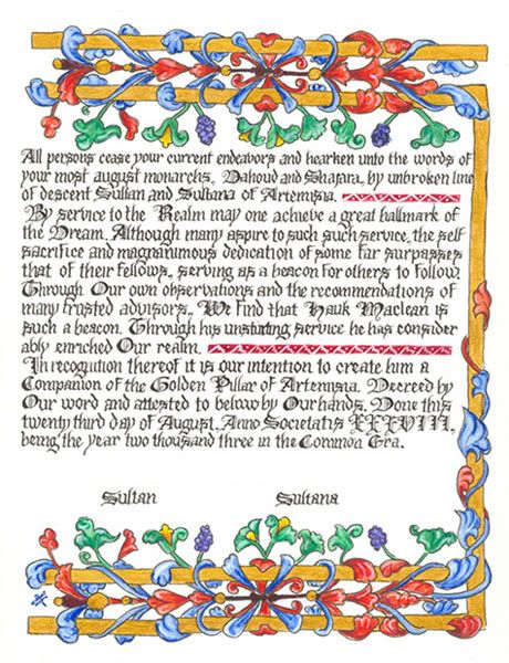
Golden Pillar - Hauk McLean, A.S. 38 photo haukpillar.jpgI recently completed another Golden Sun in Splendor scroll, this one for a very deserving Hauk MacLean.  This was kind of exciting for me to do, because in my early scribal days (11 years ago!) I did his Golden Pillar scroll (as shown here).  Both awards are for service to the Kingdom of Artemisia.  The Golden Pillar is an "Award of Arms" level, and the Golden Sun in Splendor is a "Grant of Arms" Level.  I personally feel both these awards are so very important and love seeing them given out!  Recipients are true nobles who give back to this society.
The pictures looked fine on my phone, but here are a touch blurry - how disappointing. I worked with Hauk's amazing lady to personalize it for him, using his colors, his device, and the ladybugs are representative of his two adorable daughters, whom he calls "little bug," and "big bug."


It was requested that I use a hand that was easily read - not needing a translation just to understand what it says.  I'm afraid my Uncial and half-uncial are under-utilized and I'm sorely out of practice.  It's not my best calligraphy, but I think it met the request.


Monday, February 3, 2014

Thread Covered Buttons

Sometimes called thread-wrapped, woven, or thread covered buttons, I had fun this weekend trying this little skill for the first time.  I'd read several tutorials on how to do it, and then Lady Michelle demonstrated in person, which solidified to me how I had interpreted the tutorials.  I'm a hands-on learner, so I often struggle with written directions.

Example tutorials on how to do these are here:
The Renaissance Tailor
Article by Phillip Schillawski

In doing this write-up I've also stumbled on a you-tube tutorial.  I've not watched it, but look forward to doing so soon.

I worked mine up in ver à soie silk embroidery floss over a wood bead.  After trying a few, I decided to add the yellow splendor silk ridges and pearl at the top as finishing touches.  These buttons are going on my oft ignored, but never forgotten eggplant silk veste.  Yes, the "eggplant" silk is closer to the color of these buttons than the image on the aforementioned blog post.  The fabric detests being photographed.  The yellow will tie into my butter yellow sottana which will be worn under the veste.


I'm fairly pleased, considering I'm new at this.

Tuesday, January 14, 2014

Golden Sun in Splendor Scroll

The lovely and talented Mistress Bethany of Windermere asked me to collaborate with her on a Golden Sun in Splendor scroll for Cathryn Anne of Newbury.  Bethany provided me with inspiration piece she wanted to use, and asked me to do the calligraphy in the space allotted on her layout.  Of course, I forgot to note what the inspiration was in order to tell all you good folk, but trust me, it's pretty.

Since the inspiration was in a columnar format, I decided to roll with it and divide up the space provided.  I practiced several times to make sure the nib size and formatting ended in a balanced piece of calligraphy. Aside from a minor spacing snafu, it turned out pretty decent.


Then it went back to Bethany for illumination.  Obviously, it turned out amazing, because that's all Bethany does.  Cathryn Anne is mundanely from Australia, hence the kangaroo and other little references in the illumination.
Photo by Valerie Scarbrough


If you were given an award, what little personalized references would you want hidden in the illumination that makes it "all yours?"

Monday, January 6, 2014

Gryphon & Candle Scroll

I took notice that Michelle of Harris upon York had been improving leaps and bounds in the arts, particularly when she showed me the blackwork partlet she was making as a gift for the Baroness of Loch Salann, Jennet, as a stepping down gift.  It's truly lovely and documented.

I wrote a letter of recommendation for her to receive her Baronial Arts & Sciences award as a result of my observations.  Being a sneaky person, I offered to do the scroll if his was deemed appropriate.  I had several days off for Thanksgiving, and worked hard to get this done quickly in order to focus on other things (like the napkins I already posted about).

This is based on a page in the Master of Mary of Burgundy.  With the exception of the pink ink, of course, which I had to do because it's Michelle's favorite color.  Authenticity gods will have to forgive me for that move.  It's done in Winsor & Newton Scarlet ink.  Which, as you see, looks like a lovely bright pink that does not resemble scarlet in the least.


Showing different angles of photos so you can see how shiny the gold is.  For the curious, no this is not gold leaf.  I wanted to ensure proper shading of the acanthus, and my skill at leaf is not to the level that I can do this.  So I used a combination of gold gouache and gold inks which simulate shell gold, and added shading with ocher and brown gouache.


Thank you, Bethany and Vilhelm, for allowing me to make this happen.  It had been far too long since I've painted (shame).