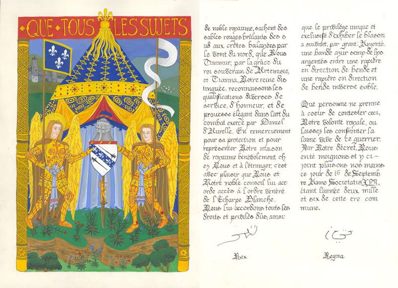
This post has been two years in the making. A dedicated website project has fallen by the wayside due to time constraints and other obligations, but I felt compelled to share my journey in the creative process that was Bethany's Key Cross. I documented the process in a private journal, so much of that will be copied here.
 November 1, 2006:
 The piece I'm inspired by/reproducing is: Graduale I. kötete It is a Hungarian scroll, c. 1510.
After multiple tests on various types of paper, I finally secured a paper in which to do this piece that could best withstand the amount of paint necessary, and not warp and buckle too badly.
In order to get a cool drop shadow effect with my gold lettering on a blue gouache-painted background, I tested several dark inks on a scrap paper. This was the same paper as that which the main piece is made of. It was likewise painted blue, with the same paint as the piece. Two inks worked well: Black Pelikan 4001, and Dark Blue Osmiroid. I decided to go with the black Pelikan ink, as I have a lot of practice with it, and know how to get good sharp lines using it. I tested it further by laying lettering over the top of it in gold gouache, to make sure the ink wouldn’t reconstitute and make the lettering a gross mucky gray.
I readjusted my layout so that there is a line of music above every line of text. The text is not quite as poetic as it once was, but c’est la vie.
I took my black Pelikan Ink, and began to carefully letter the piece, and it bled out all over the blue surface. I cannot figure out what is causing this – none of my tests behaved this way. I suspect it was because of the larger area of gouache - it behaved as if I was trying to do calligraphy on a paper towel. I was forced to paint over the black mark and start again. This time I skipped the black shadow letters and went straight for gold gouache. This is working alright, although it is a pain to work with, and the sharp lines just don’t exist.
After the first line of text it became abundantly clear that I couldn’t do the proto gothic hand well enough to do it without guiding lines, and since I can’t put guiding lines all over the blue surface, I painted over the gold letters in blue, and started from scratch again. I reverted back to my gothic textura quadrata (GTQ) hand, which I can do in my sleep. GTQ is more blocky and narrow than the inspiration scroll, but there isn’t a terribly clear difference to those who don’t study this stuff. GTQ was popular for many decades, and was used widespread throughout Europe. However this piece seems to follow Italian trends. In the 1500's, the Italians were starting to write in hands that would one day become our modern typeface - much rounder and friendly to the eye. In looking at
this website, it appears that the inspiration scroll's text was very similar to Gothic Rotunda. None of my calligraphy books have a good guide for this... which means one day I'll have to find one that does, or some up with a guide of my own.
I got all the text laid out, with only one spelling error. I may paint blue over that word and give it another go later. That's the one nice thing about doing calligraphy over a dark painted surface. It's simple to "erase" things and start again. I also began painting in the staff lines in red. For the record, red is a nightmare color: it is not opaque, and when painting over blue it becomes a nasty color – not purple as one would expect. This will take several coats of paint to make them look red, and it is tediously boring.
November 6, 2006: I finished laying out the red staff lines, and painted blue over my misspelling. When it dried, I re-did the calligraphy to correct the error. I then painted in the gold music notes on top of the staff lines. From a distance, it looks like I’ve written in Hebrew. It’s very strange, and I’m not altogether happy with the result. Unfortunately, there’s not a way to fix that, because that’s how notes looked in that period. The next painting day, I spent hours laying in the outlines in gold and red.
Problem: my gold gouache looks like craft glitter on this paper. It’s so porous; it just sucks in the gold colored pigment and leaves the gold flecks on the surface. It’s fairly luminescent, but it looks kind of weird to me. I’ll try multiple coats to see if there’s an improvement.

I penciled in the borders on three sides of the scroll, and began painting the bottom section. I have the angels mostly done. They are cute little saucy things that show a lot of leg. I can’t seem to do the serene facial expression that is dominant in Renaissance artwork.

I mixed a nice pinky-peach color for the background of the lower right hand field of swirly flowers, and thought when it dried it would lighten a touch to match the original piece. Ninja fail. I then looked at the smaller scale version of the piece, and it actually looks more tan than coral. It was WAY too bright. I laid a white wash over it to tone it down, but I think it's still a touch too coral. I'll have to paint in the flowers before toning it down or else I'll lose everything I penciled in. I'll probably blend in a tan color over the top, so it looks like the flowers are glowing coral, and the background will be more neutral. It also was a lesson in how much paint to mix - this paper soaks it in, so I have to mix much more than my instincts lead me to believe.

The right hand border is covered in little frolicking cherubs, which I don’t feel confident in reproducing. I have not drawn them in, and it looks a bit empty. Since it’s for Bethany, it would be appropriate to replace the little guys with cats… perhaps winged cats, or foxes. Her personality is a bit whimsical, so flying cats could be fun. The problem is I’m not very confident in my skills painting furry critters either.
November 7, 2006: After taking the pictures, I exiled myself to my dark cold basement and painted away. I added a dark green background behind the angels, and a gold border around the key cross, to make it pop off the green background better. I painted in their cute little toe cracks, and started to paint in the flowers on the lower right. I also mixed a mauvy-maroon color and painted the lower left section's background. Unfortunately, it's much more opaque than the peach was, so I can no longer see my sketch under it in order to paint in the flowers. I'm not quite sure how to proceed there... I'll have to paint freehand or draw in pencil over the paint (ewh!)
 November 9, 2006:
 I got back to work after one evening off. I painted in the base coats for the flowers on the lower right field. I started the shading on said flowers, and I impatiently did a little highlighting and whitework on a select few of them. I hate seeing flat colors - they must have depth!!

I also had an "oh shit" moment, when I realized that the top fields are supposed to be the same color as the bottom two, only reversed. I'm all out of the heinously bright coral color, and it will be extremely difficult to match it by mixing a new batch. *sigh* I have plenty of the mauve paint, but it will have the same problem as before - it's too opaque. I'll have to be tricky to get this to work better than the last time.
November 13, 2006: Thursday night I added detail to the bottom right flowers, and base coated the bottom left field of flowers. Friday was a holiday (yay!), so I got a lot accomplished. I added detail to the bottom left, and did the top left field in its entirety, as well as the base coat on the top right field.

Saturday I completed the top right field, started the Versal miniature, and added some details to the peach/coral fields.

I had to reposition the recorder in the Versal (It's a painting of the recipient wearing the Baronial Bardic Cloak, holding her instrument), because the way I had her turning her head looked like she was trying to shove it in her ear, This has in turn made the position of her right arm to look strange and pointless; she's holding it up for no reason. I may have to try to cover that with greenery and reposition her arm. *sigh*

Sunday started well - I worked on cleaning up the Versal miniature; fixed shading, added details, and filled in the gold background on it. Then things went downhill. I spent about three hours on one section of the right side's column. The bottom features a vase with perching cherubs holding shields. This is only about two inches of the whole column, and it took me that long. I'm really disappointed that it didn't go quicker. I'm convinced it's because of the cherubs and my lack of confidence in painting them. The poor tiny buggers have deformed hands (like all my paintings *grumble*), and have rather concerned looks on their faces.

The original manuscript has eight cherubs on the right hand column alone. I have already replaced two with a pair of winged cats, and have plans to do another set of cats at the top. That leaves two empty spaces, and I'm completely devastated at the idea of doing two more cherubs there. The positioning of the tall vase/acanthus would leave them doing a full frontal frolic, and I just can't bring myself to paint tiny jumblies. *chuckle*
 November 17, 2006:
 I worked on the Key Cross last night, so I have a couple of progress shots. I did the the cherub section Sunday - from the bottom grass up to their little heads, including the blue vase. Last night I did the winged cats, acanthus/flower details, and the frame for the center miniature.

Anyone who knows the relationship between the recipient of this piece and myself, will chuckle at the cats. They are obviously my kitties with wings. Most people need to see my kittie's collars to tell them apart - they happen to be red and blue: Blue = Kyoko, Red = Godai. So I did the wings with those colors to make it clear. I had to do this because Bethany is the one who gave me those cats. They are the adorable offspring of her cat, Widget. Mind you, she doesn't have Widget anymore, but the reality still exists.

The very top of the acanthus tower is going to be her baby, Tabuu (Boozer). I think I'm going to put One-Eyed Jack on the opposite side of Boozer, but I can't remember which eye he's missing. o_0 I'll find out, but it should look nice and balanced because they are almost identical aside from the eye, a few years, and a bit of old man fat on Boozer. I also sketched in both column's central miniatures. They both have meaning to Bethany, which I will explain as I complete them.
 November 21, 2006:
 I completed the central miniature and the upper sections of the right hand column, then filled in the background with the brilliant gold metallic gouache. This stuff is still acting strange and looking like craft glitter, but it does add an interesting aged look to it. After adding the gold, all definition was lost along with the loss of contrast between the white and the bright colors. I ended up outlining everything in a dark brown to help bring that definition back. I haven't yet outlined the outside of the red miniature frame - I'll have to do that soon.

The center miniature is of a tree with two larks in it. The significance is that the Baronial Award for Arts and Sciences for the Barony of Loch Salann is (or was, as they have since changed it to the Order of the White Lark) the Laboring Artists Recognition Company, often called the L.A.R.C. By a complete accident and fluke, Bethany was awarded this twice - hence the two L.A.R.C.'s in the tree.
I also started painting in the center miniature on the left column, but it's far from finished, so I don't have a closeup shot of it to share.
 November 27, 2006:
 The evening of Thanksgiving I painted the left center miniature: An angel holding a small branch sporting two golden colored maple leaves. The Golden Maple Leaf is the AOA level Arts and Sciences award for Artemisia. Through a complete fluke, Bethany received two of these awards, just as she received two LARCS.
Friday I painted up the bottom of the left column. The original piece is very deteriorated on that side, so it was extremely difficult to replicate. Rather than the Mermen/Flower men on the bottom, I placed images of Bethany's daughters. Since Jordan and Ashlyn look so different from one another, it is quite easy to tell who is who. Ashlyn's Persian Coat is a bit too dark of a color, but I don't really want to redo it.

Saturday I finished filling in the gold on the bottom left, and painted the upper left details. I replaced the two lower cherubs with images of Bethany's two sons. It's hard to tell the two boys apart, especially since I decided not to differentiate between all the children by size. Hopefully Bethany will be able to tell by their clothes at least.

Sunday I finished up the upper left column with details and painting in the gold. I have learned the importance of gum arabic in a major way. It helps that gold gouache behave much better than it does with just water.

I can almost finally see the light. Maybe I will have time to make a new hat for myself for Solstice Court after all...
Still left to do:
* Center top miniature
* Gold Filigree Work in Bottom Miniature
* Gold Filigree Work in Mauve Fields
* Shadows in Mauve Fields
 November 30, 2006:
 Last night I brought myself to look at this project again. I worked all evening, and got more accomplished than I had anticipated.
I completely did the top miniature, which is a candle under an arch. I chose this image for two reasons. The candle under an arch is the badge for arts and sciences in the SCA. Excellence in the arts is why Bethany is being given this scroll. Secondly, the candle is the symbol for the Cero e Luce (candle's light), the Baronial Arts and Sciences award for Gryphon's Lair. Bethany was chosen as the Premier of this order - an honor that is rare and extremely special. I was even honored enough to do her scroll for that award too.

Finishing the miniature left me some time to begin the filigree work. One thing I may not have mentioned is that this is called a Key Cross because that is the name of the award she is being given. The style of the cross the angels is holding is called "key cross." I would have done her personal device, but she doesn't have one yet. This was a reasonable substitute given the circumstances.
 December 4, 2006:
 This weekend I buckled down and finished this project. I began by adding shadows to the peach and mauve fields, using a technique called trompe l'oeile. I feathered them out using water, then began adding the gold filigree work on the mauve fields. I have to admit, I find the filigree to be too gaudy, but it's too late to take it back.

I examined the original piece and determined that instead of filigree on the peach field, they used metallic gold to highlight the green leaves.

The final task was to add shadows to the gold calligraphy. This was evidently done on the original piece, and would help one to read it if not in the perfect light (to have the gold reflect). Rather than outline the gold, I did a drop shadow style effect.

All in all, I'm pretty pleased with the outcome. It will be given to Bethany at Solstice Court on Saturday, so I managed to finish it with a few days to spare.