
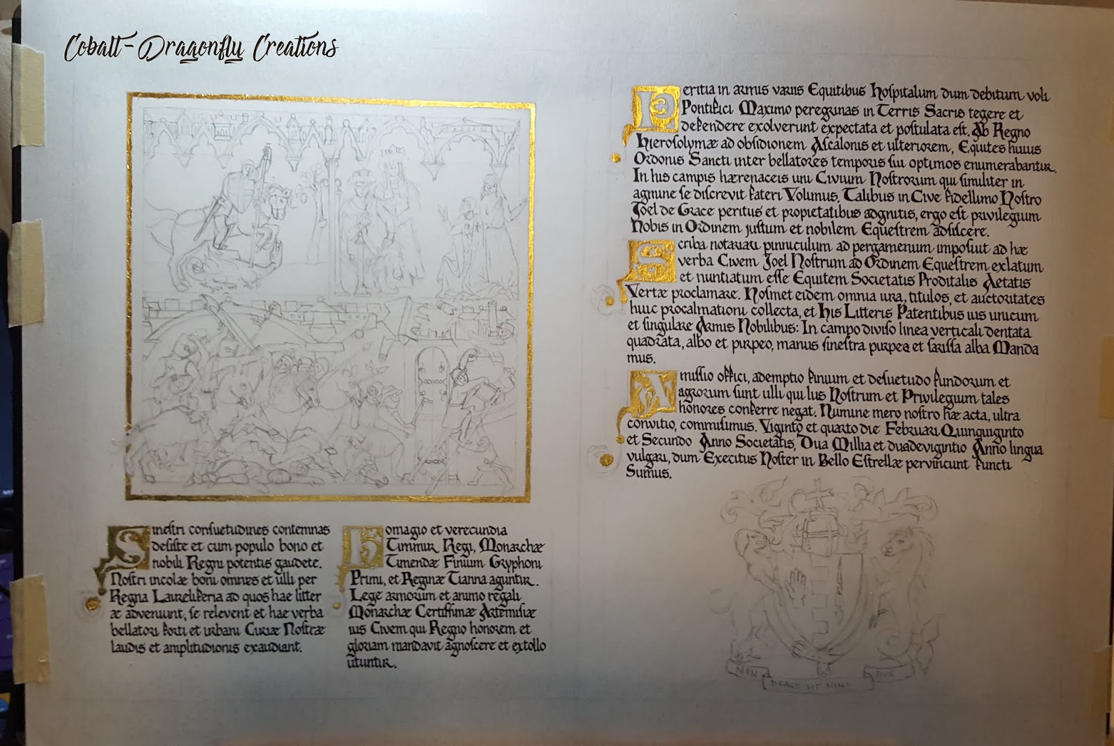
Countess Gwenevere McKay became my information funnel, telling me all about the recipient (whom I knew from a distance but had never interacted with). It was from her information that details specific to Joel were included in the illumination, including his Crusader persona, the image of him slaying a dragon, and of course his choice in supporters for his achievement of arms.
The text was written by His Highness Prince Sean, and was translated into Latin by Master Drix. There was a hidden message in the text, but it is only evident in the English version, alas. I'll leave that secret between Sean and Joel.
Given Joel's Crusader persona, and his apparent obsessive study of it, the obvious inspiration choice was to base the scroll on the Crusader Bible. Each page has architectural details in the illumination panels. My version was not a direct copy of any specific folio, but an amalgamation of several, keeping to the appropriate style and color schemes.
 |
| Crusader Bible, Folio 5v |
 |
| Crusader Bible, Folio 40r |


Illumination features Joel slaying a dragon in the upper left quadrant. In the upper right, we have Their Majesties Timmur and Tianna calling Joel forward to be put on vigil. Joel's lovely Lady, Agnella, is featured here as well.
The lower half of the square is a traditional Crusader Bible inspired action scene, full of far more death and gore than I've ever painted. There are a ton of tiny details, so click the image to zoom in and see the carnage.

Boring details:
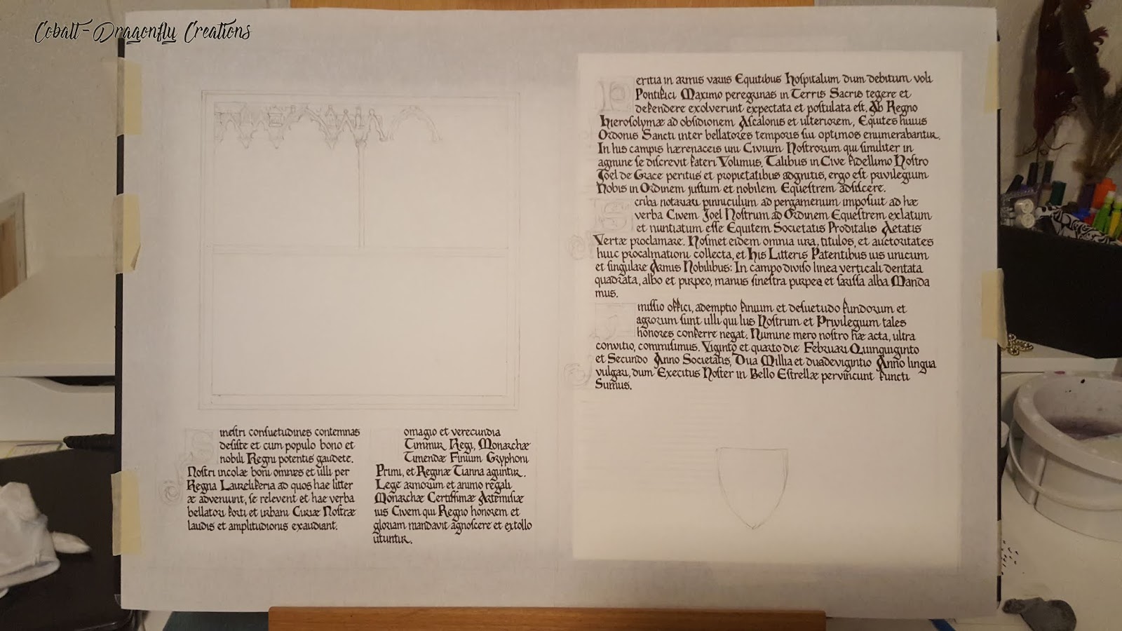
First I blocked out the space needed for the square Crusader Bible illumination. Since the Crusader Bible doesn't have much text on any pages, I wanted the illumination to be very prominent. Making this look like a two page spread was the only way to fit all the necessary text and make this happen. I started on the sketching phase as well, but didn't get far before I started on the calligraphy.
I then laid the full calligraphy down. I considered keeping two columns on the right folio as with the left, but decided against it, as the Crusader Bible has pages with both one and two columns, so I opted for the uniqueness of that format. (This also keeps things easier).
After that was complete, I sketched out all of the illumination in detail, did the gold leaf, then began painting. Below are pics of the progress, from start to finish. As always, click to enlarge.
This piece is done on pergamenata with Pilot Iroshizuko Sumi ink, 24 carat gold leaf, Winsor & Newton gouache, and Finetec micah pigment in gold.


